Page Designer
Design every booth screen, from the welcome page to the result page, with elements, buttons, backgrounds, animations and page options.
Every screen your guests see, from the welcome page to the result, is built with the same page designer in the DESIGN group of the Event Editor. Learn it once on one page and you can design them all. Each page has its own canvas, sized to the event's aspect ratio.
Chapters (11)
The pages and the guest's journey
At the booth, a guest moves through these pages in order:
- Welcome Page: the first screen; the guest taps start.
- Survey questions, if a survey is live (shown on the Input Page; see Survey).
- Category Picker: only when categories are shown As Standalone Page.
- Template Picker: the guest chooses a template. Skipped when only one template is switched on, or when the guest already picked a template on the Welcome Page.
- Input Page: only when the template asks for input (collage text or dynamic prompt questions).
- Camera Page: countdown, shot, review.
- Processing Page: the wait while the result is made.
- Result Page: print, QR, email, SMS, WhatsApp, or back to start.
Before you design, set the event's aspect ratio: it is the size of every canvas.
DESIGN › General: theme, background and music
Start in DESIGN › General. These settings apply across every page.
| Box | Options |
|---|---|
| EVENT THEME | Import Theme loads a complete look in one go: every page layout, the backgrounds, the music and the aspect ratio. Templates and categories are kept. Export Theme saves your own design as a theme to reuse in other events. |
| BACKGROUND | The global background, used on every page that has none of its own. Choose Solid color or Media (images or videos via Manage Background Media; with several files, each session gets one at random). Layout: Center, Tile, Zoom or Stretch. |
| BACKGROUND MUSIC | Play background music during the event. Play mode: New per session (a fresh track for every guest) or Continuous (one playlist that keeps playing across sessions). Volume, and the track list in Manage BGM Tracks. |
Import Theme replaces the current design of all pages. Export your own theme first if you might want it back.
The designer layout
Open any page in the DESIGN group, for example Welcome Page.
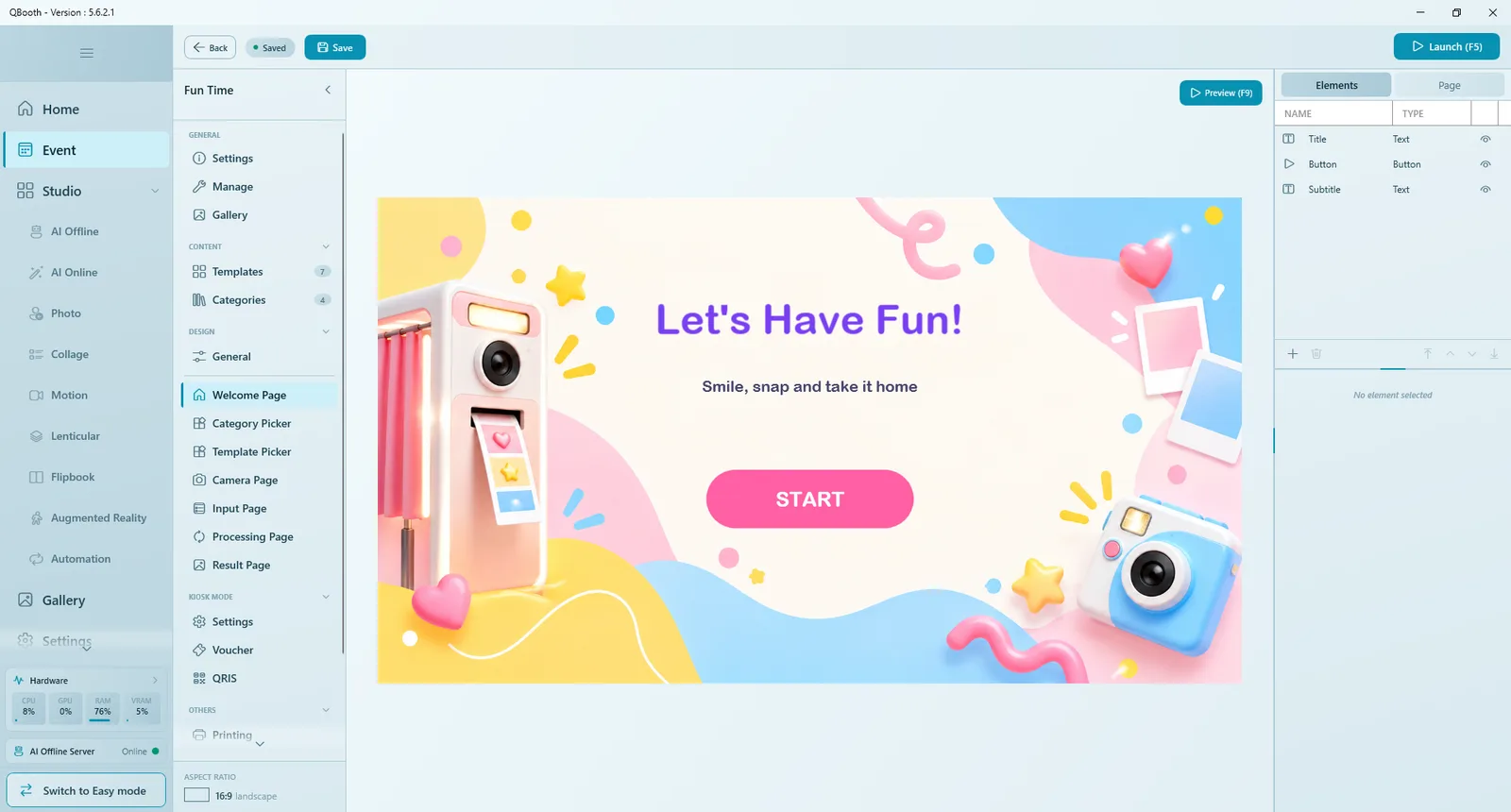
| Part | What it does |
|---|---|
| Canvas | The page exactly as guests will see it. Click an element to select it, drag it to move, pull its handles to resize. |
| Preview (F9) | Plays this page full screen on the event's output monitor, with its animations and sounds. Nothing real runs (no camera, no template). Click anywhere or press Esc to close. |
| Preview next background | When the page has several backgrounds, cycles through them on the canvas. |
| Elements tab | The list of everything on the page, with NAME, TYPE and an eye icon to hide or show each element. |
| Page tab | Settings for the page as a whole: background, intro audio and page-specific options. |
| Element toolbar | Add element (+), Duplicate element, Delete element (or the Delete key), and the layer buttons Bring to front, Bring forward, Send backward, Send to back. |
| Properties panel | Appears under the list when an element is selected. |
Working with elements
The same steps work on every page.
- Click Add element (+) under the element list and choose a type: Button, Text, Image, Video or Shape (the Processing Page has no Button). Some pages add their own types: Template Gallery on the Welcome Page and Template Picker, Live View Toggle (Live View) and Navigation (Review) on the Camera Page.
- The element appears on the canvas. Drag it into place and pull its corners to resize it, or type exact values under POSITION & SIZE (X, Y, W, H).
- Set its properties (see the table below).
- Under APPEARANCE, set Opacity and Corner (rounded corners; the maximum makes a pill or circle).
- Under ANIMATION, choose an Entrance effect (how the element appears when the page opens: None, Fade, Slide, Zoom or Bounce, with Speed, Delay and Direction) and an Idle effect (a motion that loops while it is on screen: None, Pulse, Float, Breathing, Wiggle or Spin, with Speed and Intensity Subtle, Medium or Strong).
- Press Preview (F9) to check, then Save.
Text, Image, Video and Shape
| Element | Settings |
|---|---|
| Text | The text plus a FONT section: Family, Size, Align, Color and Shadow (None, Drop or Glow, with Tint and Strength). A shadow keeps text readable on busy backgrounds (since 5.3.1.0). |
| Image | A picture. |
| Video | A video, with Volume. |
| Shape | Decoration: Rectangle, Ellipse, Polygon (set Sides) or Star (Points, Spikiness), with Fill and Outline (since 5.3.1.0). |
Layers, hiding and required elements
- Elements sit in layers. Use the four layer buttons (or drag in the list) to bring one forward or send it back. The top of the list is in front.
- The eye icon hides an element without deleting it. Hiding is saved and applies at the live booth too.
- Elements marked with a star are required for the page to work (for example the Countdown or the Result Viewer). They can be hidden with the eye but not deleted. A few have no eye at all because they must always be there: the Camera Feed, the Input Page keyboard and the Processing Page logo.
- Click an element's name in the list to rename it, so the list stays easy to read.
Buttons
Select a button to see its BUTTON properties.
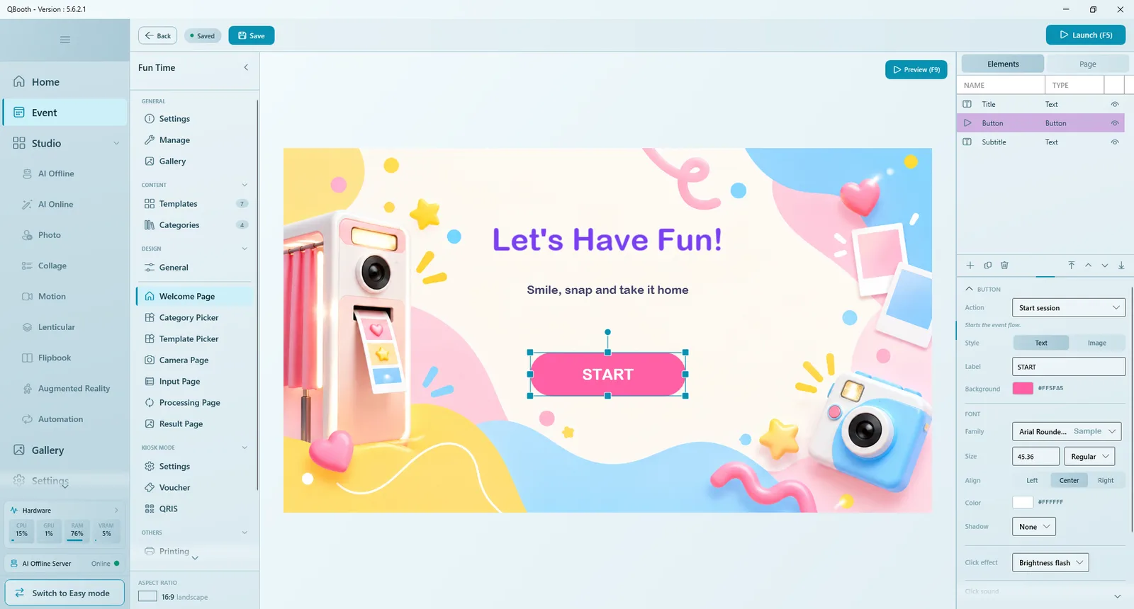
| Property | What it does |
|---|---|
| Action | What the button does on this page. The list depends on the page (see the table below). |
| Style | Text: a Label on a Background color with its own FONT. Image: your own picture (Standby image, plus an optional Pressed image (optional) shown while it is tapped). |
| Click effect | Brightness flash (the default), Glow pulse, Tint, Lift shadow or None, with Color / Intensity where they apply. |
| Click sound | Any audio file, played on every tap, with its own Volume. |
| Page | Actions offered |
|---|---|
| Welcome Page | Start session, Launch Gallery, Open category filter, Open URL |
| Category Picker | Back, Next, Open URL |
| Template Picker | Back, Next, Open category filter, Open URL |
| Input Page | Back, Next |
| Camera Page | Capture, Back, Process, Retake, Switch camera |
| Result Page | Back to Home, Print, Share, Share: Web QR, Share: Local QR, Share: Email, Share: SMS, Share: WhatsApp, Reprocess, Restart Session, Switch Template, Show All Results, Open URL |
The Result Page's share actions were renamed in 5.8.0.0: Web QR, Local QR and Send Email are now Share: Web QR, Share: Local QR and Share: Email. Share and Share: WhatsApp are new (see Result Page). Share: SMS was added in 5.9.2.0.
Open URL asks for a URL and where to open it (Open in: In-App, a built-in browser with a close button, or Browser). It is not offered on the Input, Camera or Processing pages.
Buttons show up at the booth according to their action, not their name, so you can rename them freely.
The Page tab
Click Page at the top of the right panel for settings that belong to the whole page.
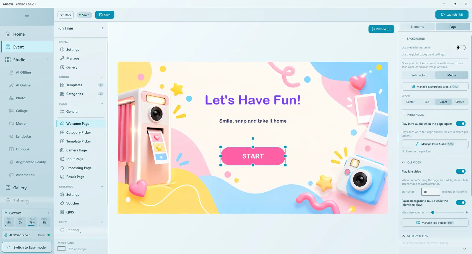
| Group | Options |
|---|---|
| BACKGROUND | Use global background follows DESIGN › General. Turn it off to give the page its own Solid color or Media (up to 15 files in Manage Background Media, one picked at random each session), with Layout and, for video, Volume. |
| Intro Audio | Play intro audio when the page opens: Manage Intro Audio holds up to 15 clips; one is picked per session and plays once when the page opens. |
| IDLE VIDEO (Welcome Page) | Play idle video full screen when nobody has touched the page for the number of seconds in Start after (default 30). Options: Pause background music while the idle video plays, Idle video volume, and the clips in Manage Idle Videos. |
| Gallery Access (Welcome Page) | Extra ways for staff to open the event gallery during the event: Secret area (double-click the top-left corner) and Hotkey (Shift+F2), optionally with Require PIN. Both are on for new events (since 5.5.3.0). |
| Start Session (Welcome Page) | Require PIN before a session can start, to keep the booth closed until staff unlock it. |
| Start gate (Welcome Page) | Shows whether Kiosk Mode (voucher or payment) is required before a session starts, with a Configure in Kiosk Mode → link. |
Every media list (backgrounds, idle videos, intro audio, music, capture sounds, cue videos, countdown audio, processing media) holds up to 15 items. Other pages have their own Page tab options, described below.
Welcome Page
The first screen guests see, and also the standby screen when the booth is idle. It needs one thing: a clear way to start.
- Add a Button and set its Action to Start session. Make it big and easy to spot. Without it (and without a Template Gallery) the editor warns No Start button - can't start session.
- Add a title and a short subtitle with Text, and decorations with Image, Video or Shape.
- Give the title an entrance effect and the start button an idle effect such as a pulse.
- In the Page tab, set the background and an idle video to attract passers-by.
Other useful actions here: Launch Gallery (opens the event's result gallery), Open category filter and Open URL.
Templates on the Welcome Page
Since 5.5.0.0 you can add a Template Gallery to the Welcome Page to show your templates right on the first screen. A guest taps one and goes straight to the camera, skipping the Template Picker. With a gallery you don't need a Start button, but you can keep both. Its settings are the same as on the Template Picker.
If you use Kiosk Mode, guests pass a payment or voucher step right after tapping start.
Category Picker
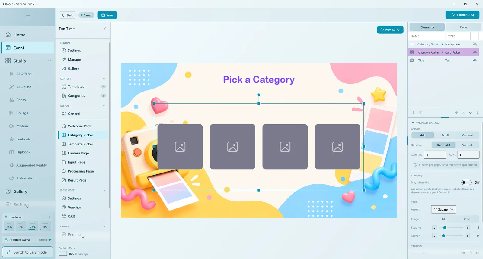
Appears only when Display Mode is As Standalone Page. It shows a Category Gallery with one card per category (its cover, or its name when there is no cover), its Navigation and a title. Set up the card gallery exactly as on the Template Picker below. Add a Back button if guests should be able to return. There is no Simulate here; use Preview (F9). Like the Template Picker, it has its own time limit on its Page tab.
Template Picker
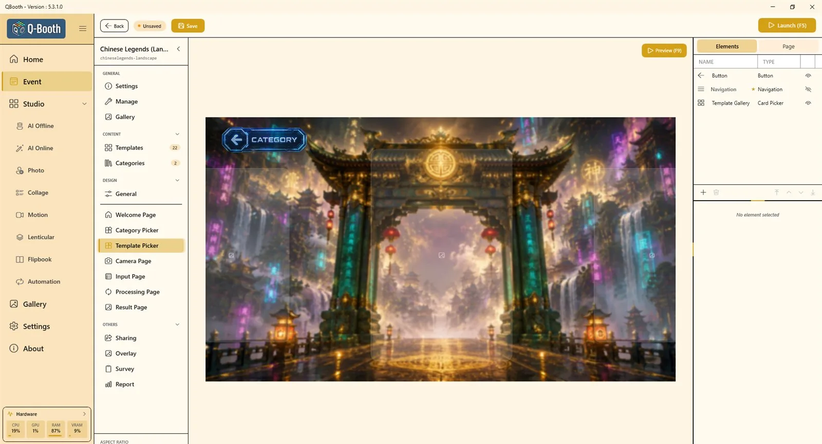
Where guests choose a template. Its main element is the Template Gallery (a card picker showing the event's switched-on templates). If the page has no gallery, the editor warns No gallery on this page — guests will have nothing to pick; add one with Add element (+). You can add more galleries, each pinned to its own category (since 5.3.1.0); each arrives with its own Navigation.
| Gallery setting | Options |
|---|---|
| CATEGORY | All (the category the guest picked, or everything), No Category (only templates without a category), Select (pins this gallery to one category, whatever the guest picked). |
| LAYOUT | Grid (pages of cards), Scroll (a continuous row, with Cards / Row) or Carousel (one centered card with the neighbours peeking in). Direction: horizontal or vertical. In a grid, Columns and Rows set the cards per page; extra templates spill onto the next page. Carousel adds Side Cards and Loop. |
| Auto-play | Play when idle: the gallery scrolls by itself after Start after seconds of stillness, at Slow, Medium or Fast, and stops as soon as a guest touches it (since 5.5.0.0). |
| CARD | Aspect (card shape, or custom), Image Fit or Crop, Spacing, Corner. |
| CAPTION | Show caption with font, background and opacity. In a carousel only the centered card shows its caption. |
| Sound | Card Tap Sound, and on a carousel a Swipe Tick Sound. |
- The Navigation element moves between pages of cards: Style Buttons or Dots, Prev / Next, Page Number, and Swipe on element (drag across the navigation box to flip pages). It is separate from the gallery; resize its box to make the buttons bigger.
- Button actions on this page include Back (return to the previous page), Open category filter (for categories As Filter) and Next. With a Next button on the page, tapping a card only selects it and the guest presses Next to continue (since 5.3.0.0); without one, a tap goes straight on.
- Match the card Aspect to your template covers (for example 2:3 for portrait prints) so covers are not cropped.
Time limit and Picker Timer
Since 5.8.0.0 the Template Picker and the Category Picker each have their own time limit, so a guest who walks away doesn't hold the booth. Set it on the page's Page › TIME LIMIT. It works with or without Kiosk Mode.
- Time: Off, 30s, 1m, 2m, 3m, 5m or Custom (seconds, minimum 15).
- When time runs out: Back to Home ends the session (on a paid event the guest loses what they paid). Random or First template (or category) picks for the guest and carries on.
- Restart timer on tap: on, every tap starts the timer over; off, every guest gets a fixed time.
- The Template Picker limit isn't used when guests pick a template on the Welcome Page.
The Picker Timer element shows guests the time left. It only shows it: hiding it with the eye hides the countdown, but the limit still runs. Its settings are style and text, plus a Set the time on the Page tab link.
Random or First together with auto capture and auto process means a guest who walked away still gets photos taken and processed. On an AI template that costs money.
Camera Page
The page with the most options. It has two states, switched at the top of the right panel: Live View (what guests see while shooting) and Review (the shots before going on). Some Live View elements (Camera Feed, Filter Strip, Back) also show in Review as a faint outline.
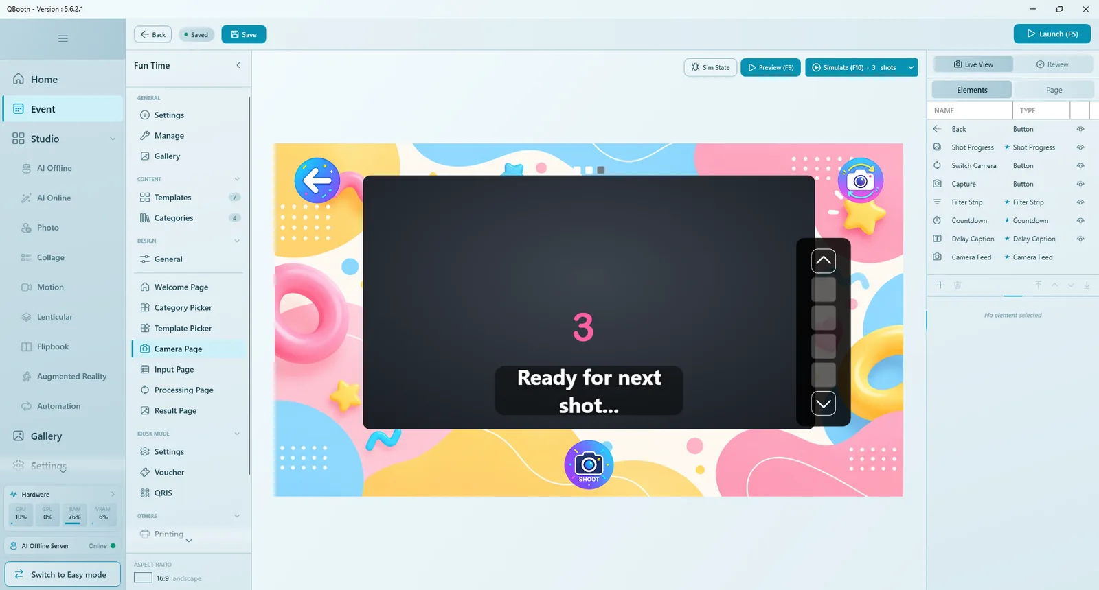
| Element | What it does |
|---|---|
| CAMERA FEED | The live camera picture (and the photo after the shot). Fit Cover or Contain, Border (None, Thin, Frame), Corner, Border color, Mirror preview, Drop shadow, Aspect ratio lock, and Zoom to crop (on by default, since 5.5.4.0): it enlarges the framed area so guests see themselves bigger, live view only; the photo itself is unchanged. With it off, the whole camera picture shows and a red guide marks the crop of the template the guest picked. The Camera Feed can't be hidden. |
| Countdown | The big numbers before each shot. Start at 1–10 (default 3), style, font, color, Sound (None, Sound Pack, or My Audio: your own clips in Manage Audio, each one a full "5-4-3-2-1"), Volume and Pause background music during countdown. It is a required element: it can't be removed, but if you hide it with the eye the shot fires as soon as Capture is pressed. |
| Shot Progress | Shows which shot the guest is on, for example "Shoot 2 of 3". Format uses {n} and {total}; Style Text or Segments. Appears only for templates with more than one shot. |
| DELAY CAPTION | Text shown between shots, such as "Ready for next shot…", with {n} / {total}. Never shown in single-shot sessions. It also holds Auto capture next shot (on: the next countdown starts by itself; off: the guest presses Capture for each shot) and Delay (1–5 seconds between shots) (since 5.5.0.0). |
| Hold Caption | "Hold your pose…" (since 5.8.2.0), for a Canon that is slow to fire. The flash and sound still play when the countdown ends; if the camera hasn't taken the photo after Show after (0–2 seconds, default 1), this caption shows until it has, so guests don't move too early. It is a normal element with its own Text (leave it empty for "Hold your pose…" in the app's language), font size, color and style, Background, size and position — make the font bigger if guests can't read it from where they stand. Hide it with the eye to turn it off. A fast camera never shows it; Webcam, Freeze Frame and Shoot from the camera ignore it. (In 5.8.1.1 the message sat inside the countdown box, with its settings in the Page tab.) |
| Filter Strip | A row of filters guests can choose. Display during: Before (on the live view), After (on the photo) or Both. It appears only when the event has two or more filters (see Overlay & Filters). Since 5.9.0.0, when the template has a Beauty Filter, a Beauty tile shows first in the strip, even with 0 or 1 filters. It starts on; the guest taps it to turn beauty off or on, on the live view or in Review. |
| Buttons | Live View: Capture, Switch camera (hidden when only one camera is set up), Back. Review: Process and Retake, plus a Navigation element to page through several shots. Buttons show only in the right state, decided by their action. A Retake button has After tap (since 5.8.0.1): Countdown (the default) re-shoots the photo right away; Live View goes back to the camera and waits for the guest to press Capture, the way Q-Booth v3 worked. |
| Camera Timer | Shows guests the time left on the Camera Page (since 5.8.0.0), separate from the shot Countdown. The time is set on the Page tab (TIME LIMIT, below); hiding this element doesn't stop the limit. |
| Live View Toggle | Optional, Canon only (since 5.5.0.0). Lets a guest switch between the live view and the Canon's own shutter button, with a caption for each side. |
There is no shot-count setting on the Camera Page. The number of shots comes from the template the guest picks; for example a collage with three photo slots takes three shots in a row.
After the shot
After the flash, the screen holds the moment of the shot until the photo is ready (since 5.8.1.0). It is not frozen. With a DSLR the photo then appears a little sharper and brighter than the held frame, because the held frame is the live view and the photo is the real shot. Video shots keep the live view while recording. The loading icon over the held shot is set in the Page tab (Show a loading icon while the photo is prepared).
If the camera can't take the photo (since 5.8.0.0), the camera box turns into a black error box: Couldn't take the photo, an error code and the reason in plain words (for a Canon: lens retracted, couldn't focus, memory card problem…). It stays until someone presses [ Continue ], which takes that same shot again. Earlier shots of a strip are kept. Since 5.8.1.1 a Canon photo that can't be saved to the PC (for example a full disk) shows here too. Causes and fixes: Troubleshooting.
Camera Page: Page tab
| Option | What it does |
|---|---|
| Gesture control | Since 5.9.0.0, its own section right after Intro Audio: guests use hand gestures instead of touching the screen. Use gesture control turns it on (off by default), Show gesture guide (on by default) shows an animated hand over the camera view, and Try it lets you test each gesture yourself. See Gesture control below. |
| Capture Sound | A sound at the moment of the shot (Manage Capture Sounds, volume). |
| Cue Video | Play cue video before the shot: a short full-screen clip right after the countdown, for example "look at the camera". Clips in Manage Cue Videos, volume, and options Pause background music while the cue video plays, Start 1 second before the shot, Only show cue video once. |
| Hide Back button after capture | Guests cannot leave by accident in the middle of a session. |
| Flash effect on capture | Flashes the screen white when the shot fires. |
| Show a loading icon while the photo is prepared | On by default (since 5.8.2.0). After the shot the screen holds that moment, with a spinning icon while the photo comes off the camera and is cropped and filtered. The icon only appears if that takes longer than Show after (0–5 seconds, default 1), so on a fast setup guests never see it; it mostly shows on a slow PC or a long exposure. Turn it off for no icon at all. On a Canon the wait counts from the moment the camera has taken the photo, so it never shows together with "Hold your pose…". |
| Auto capture | Skips the Capture button: the shot fires by itself after Capture after 1–10 seconds. |
| Auto process | Taps Process by itself after Process after 1–10 seconds. Together with Auto capture, the booth runs hands-free. |
| Shoot from the camera | Canon only (since 5.5.0.0): guests press the camera's own shutter button; there is no live view on screen. Ignored for video templates. |
| TIME LIMIT | Since 5.8.0.0: how long a guest can stay on the Camera Page, retakes included. Off, 30s, 1m, 2m, 3m, 5m or Custom (seconds, minimum 15). When time runs out: Finish (the default: shots still left are taken with the normal countdown, then processed) or Back to Home. Restart timer on tap works as on the pickers. A shot already counting down always finishes. Not used when shooting from the camera with live view off. Retakes per guest: Unlimited, 1, 2, 3 or 5; once they are used up, the Retake button disappears for the whole session. |
The pause between shots of a multi-shot template is not set here: it is on the Delay Caption element (see above).
Gesture control
Since 5.9.0.0 guests can use their hands instead of the screen. Turn it on in the Camera Page's Page › Gesture control › Use gesture control.
| Gesture | What it does |
|---|---|
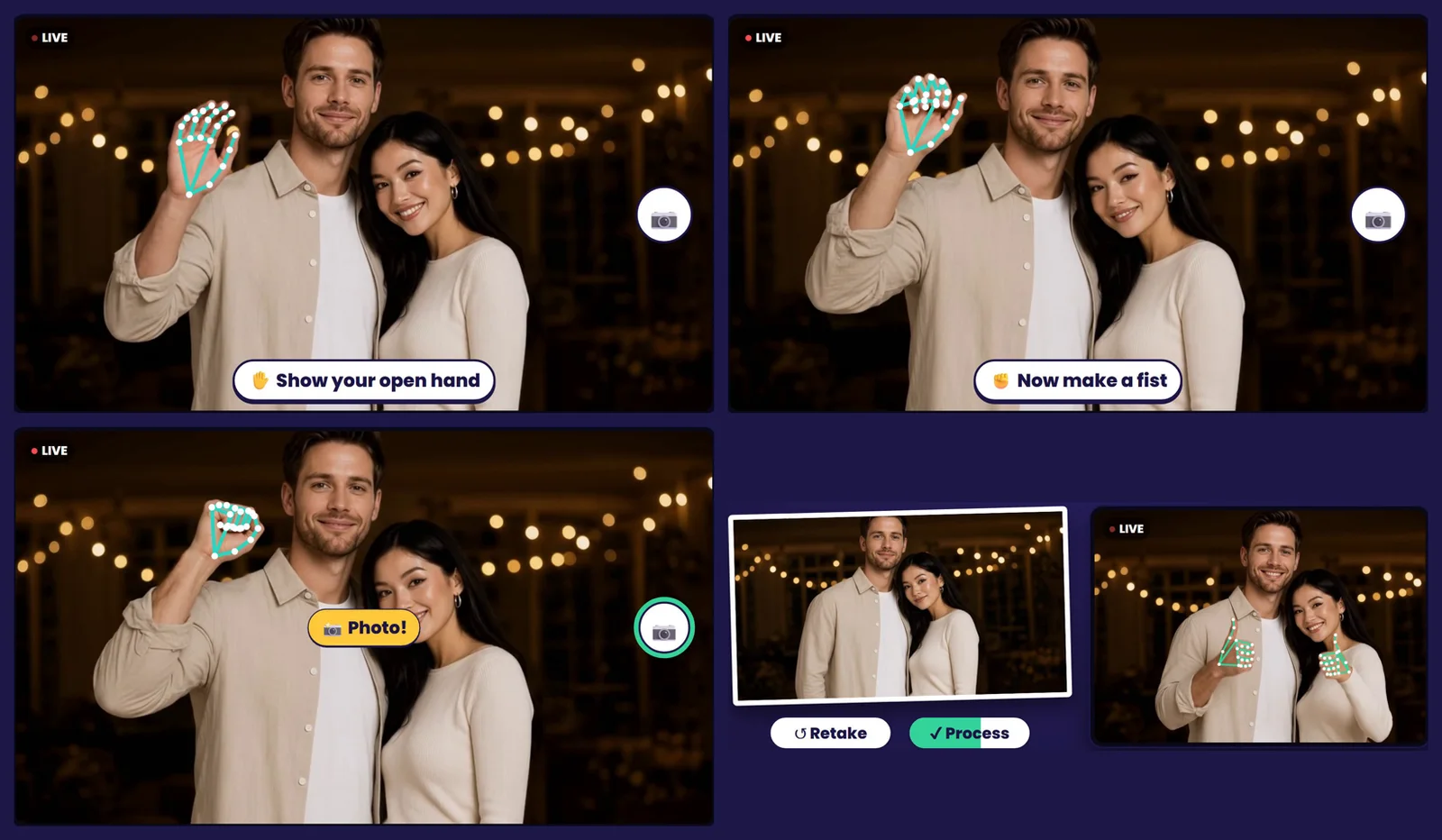
| Open hand, then a fist held for 1 second | The same as pressing Capture: the countdown starts. A circle fills next to the Capture button while the fist is held. Works whenever the Capture button would. |
| Thumbs up, held 1 second (Review) | Process. |
| Thumbs down, held 1.5 seconds (Review) | Retake of the photo shown. |
- Each Review gesture works only while its button is on screen. No Retake button (or no retakes left) means no thumbs down.
- There is no hold-time setting; the times above are fixed.
- Show gesture guide (on by default) shows an animated hand over the camera view. It plays big once when the page opens, then moves to the top-right corner. It turns green while a gesture is held and gives hints such as "Come closer" or "Open your hand first". It is hidden during the countdown. You can see it on the editor canvas and in Preview too.
- Try it opens the camera so you can test each gesture yourself. Click a gesture, stand where guests will stand, and do it. Nothing is photographed.
- The first time, the app asks to download the vision pack files (about 10 MB, once per PC). Click Download in this section or in Try it. A PC set up with the installer from 23-10-2026 or newer already has them, so there's nothing to download. After that, gesture detection runs on the PC with no internet needed.
- It needs the camera's live view on screen: a webcam or a Canon in live view. It doesn't work with a GoPro, or with Shoot from the camera.
- Auto capture and auto process keep working. Their timer stops while a gesture is being held and starts over if the guest lets go.
- Easy mode has the same switch and Try it on the wizard's last step (the guide is always on there).
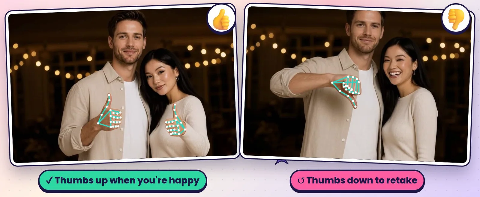
Simulate (F10)
Simulate (F10), only on the Camera Page, walks through the whole capture flow with sample photos instead of a camera: countdown, cue video, flash, several shots, retake, filter strip, and auto capture / process. Choose 1 or 3 shots with the arrow beside the button. Press R to restart and Esc to exit. Pressing Process just shows "Process triggered". To test gestures, press G for palm then fist, and U / D for thumbs up / down. Sim State on the canvas steps through the page's states while designing.
Input Page
Shows questions guests answer on the booth screen: survey questions (right after Start, if the event has a survey), text a collage template asks for, or choices for a dynamic prompt (see Survey and Dynamic prompt). If a template needs none of these, the page is skipped.
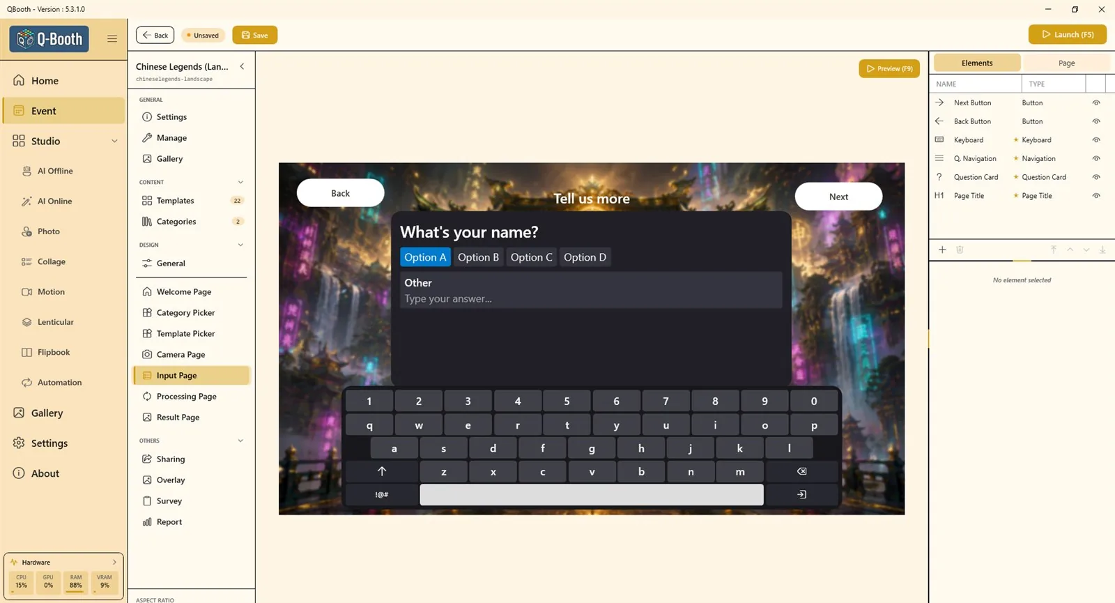
| Element | What it does |
|---|---|
| PAGE TITLE | A title that changes with the kind of question being asked. |
| QUESTION CARD | Shows the current question and collects the answer. Colors, fonts and the multiple-choice STYLE (Pills, Cards, List; Continuous or One per row). |
| Q. NAVIGATION | Previous / next arrows and an optional "N of M" counter. |
| ON-SCREEN KEYBOARD | Position, size and colors. It pops up when a guest taps a text field. Options: Include number row, Include special characters (!@#), Include email domain row (@gmail.com ...), Auto-capitalize sentences. |
| Back Button / Next Button | Back and Next buttons. Next becomes active once every question is answered. |
The designer shows sample questions, not your template's real ones; check the real questions with Launch (F5). There is no number-only answer type, so keep Include number row on when guests have to type numbers (a phone number, a table number).
Processing Page
What guests see while the result is being made. Choose the Processing display at the top of the page:
- Simple Dialog: a small box with a looping loading animation. Manage Display Media holds images or clips (one picked at random each session; empty = the app's own animation); Display Size sets its Width and Height (240–1200).
- Designer Page: a full page you design yourself, for example with a colorful video, a timer and fun messages.
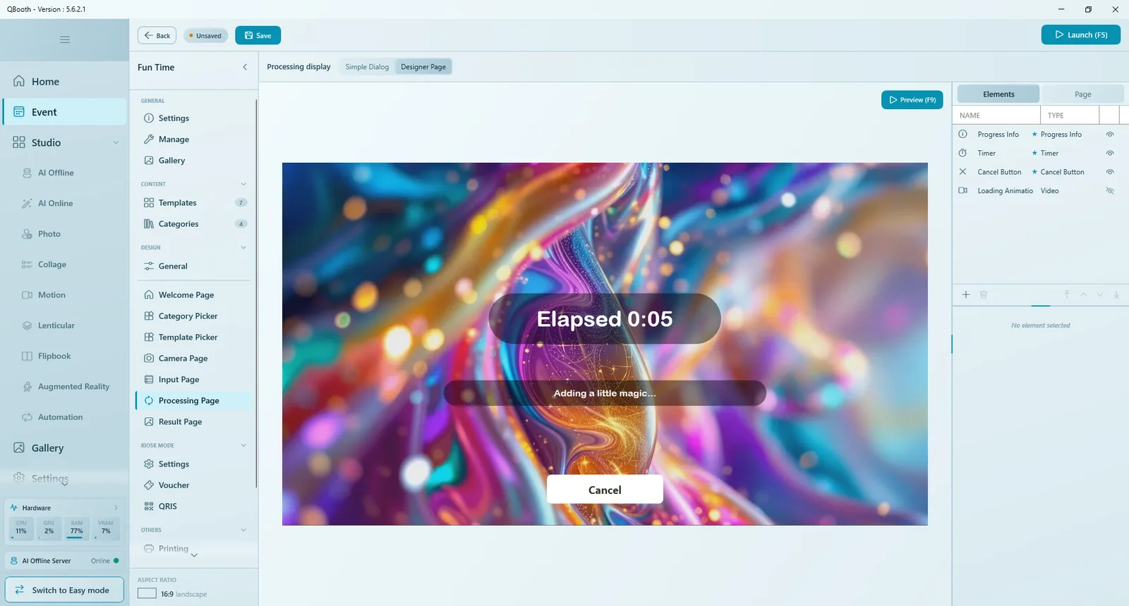
| Element / option | What it does |
|---|---|
| Progress Info | The live status line. |
| Timer | Elapsed time. Format uses {x} for the time, for example "Elapsed {x}". |
| Cancel Button | Stops the job and returns the guest to the camera. It appears only after the cancel delay set in Settings (default 60 seconds). |
| Loading Animation, Logo | A video or image that plays while waiting, and the app logo (hidden automatically on white-label licenses). |
| Use fun messages (both modes) | Replaces the technical status with playful lines that change every 5 seconds (since 5.3.1.0). |
| Minimum show time (both modes) | Keeps the page up at least this long, 0–30 seconds (0 = off), so very fast templates do not cause a jarring flash. |
Result Page
Shows the finished result with your buttons. Built-in elements: RESULT VIEWER (the photo or video; swipe when there are several results), QR CODE, RESULT TIMER and Navigation (pages through several results; hidden by default). A new event also gets Back to Home, Print and Share QR buttons (Share QR uses the Share: Web QR action, called Web QR before 5.8.0.0).
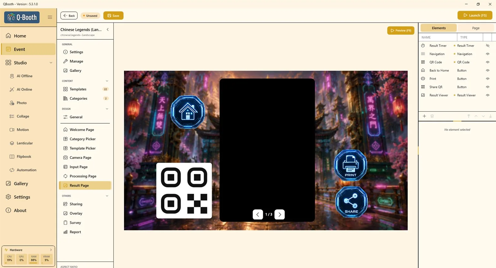
| Item | What it does |
|---|---|
| RESULT VIEWER | Aspect ratio (Original follows the result's own shape; Free lets you size the box), Corner, Border and Border color. |
| QR CODE | Guests scan it to download their photo. It spins while the photo uploads, then shows the real code. While it is visible every result is uploaded automatically, whatever the upload mode, so the code always has a live link. It stays square. |
| RESULT TIMER | Returns the booth to the Welcome Page after a while, so the next guest can start. The element only shows the countdown: Style Text (with {x} for the seconds left) or Arc. The time itself is set on the Page tab (see below). Hiding the timer with the eye only hides the countdown on screen; the auto-return still happens unless it is Off. |
Button actions on the Result Page:
| Action | What it does |
|---|---|
| Back to Home | Ends the session and returns to the Welcome Page. |
| Prints the result shown (see Sharing and printing). | |
| Share | One button for several share ways (since 5.8.0.0). Under the action, Share by: tick Web QR, Local QR, Email and WhatsApp (all ticked on a new button), and since 5.9.2.0 SMS. At the booth it opens a menu of the ticked ways that work right now; if only one works, it opens straight away. If you tick nothing, the editor warns you the button stays hidden. |
| Share: Web QR / Share: Local QR | Shows a QR code for the result, over the internet or over the booth's own Wi-Fi. (Called Web QR / Local QR before 5.8.0.0.) |
| Share: Email | Asks for an address and emails the guest a link. (Called Send Email before 5.8.0.0.) |
| Share: SMS | Since 5.9.2.0: asks the guest for their mobile number on a keypad and texts them a link, through your own Twilio account. Needs Web QR and SMS Share (Twilio) set up in Settings; otherwise the guest sees "SMS isn't set up." See SMS Share with Twilio. |
| Share: WhatsApp | Since 5.8.0.0: shows a QR that opens WhatsApp with a message ready; the guest presses Send and gets the photo in the chat. Needs Web QR set to the QBooth cloud service (not FTP); otherwise the button is hidden and the editor shows a warning. Not available on BleepShare. |
| Reprocess | Makes the result again from the same shots. |
| Restart Session | Same template, straight back to the Camera Page for new shots. |
| Switch Template | Runs the same photos through another template that fits them (since 5.5.0.0). Hidden when no other template fits. |
| Show All Results | Shows every result of this session. |
| Open URL | Opens a web link in the app or in the browser. |
There is no separate "enable email" switch: a Share: Email button (or a Share button with Email ticked) on the Result Page is what offers email. An email method must be set up in Settings.
In Preview (F9), result buttons show a short message such as "Print triggered" instead of acting.
In Kiosk Mode, Restart Session and Switch Template are hidden so a guest cannot start again without paying. The result page keeps its own timer (Page tab, below); before 5.8.0.0, Kiosk Mode's own result page timer replaced it.
Result Page: Page tab
Since 5.8.0.0 the time before the booth returns to the Welcome Page is set on the Result Page's Page › TIME LIMIT:
- The time: Off, 30s, 1m, 2m, 3m, 5m or Custom (seconds, minimum 15). A new event has 60 seconds. Off means no auto-return, and the countdown is hidden.
- Restart timer on tap: on (the default), every button tap starts the timer over; off, every guest gets a fixed time.
This is the only place the time is set, Kiosk Mode included. Before 5.8.0.0 the time was on the Result Timer element itself.
Preview, Simulate and Launch
| Tool | Where | What it tests |
|---|---|---|
| Preview (F9) | Every page | The look of one page with animations. No camera, no template. |
| Simulate (F10) | Camera Page only | The full capture flow with sample photos instead of a camera. |
| Launch (F5) | Event Editor (or Launch on the event card) | The real booth: real camera, real templates, print, QR and email. |
Design tips
- Design for the real screen: check text size and button size from where guests will stand.
- Keep one clear action per page; make that button the biggest thing on screen.
- Use a shadow on text placed over busy backgrounds.
- Keep backgrounds, fonts and button style consistent from page to page.
- Use Export Theme once a design works, so you can apply it to the next event in one click.
Common problems
Guests cannot start a session.
The Welcome Page needs a button with the Start session action (or a Template Gallery). Also check whether Start Session › Require PIN is on in the Page tab.
The photo is taken without a countdown.
The Countdown element on the Camera Page is hidden. Show it again with its eye icon in Live View.
Guests pick a template by accident.
Add a button with the Next action to the Template Picker, so a tap only selects a card and the guest confirms with Next.
The Template Picker is skipped.
Only one template (or category) is switched on, so the booth skips the choice automatically.
The filter strip does not appear at the booth.
It only appears when two or more filters are available for the event, or (since 5.9.0.0) when the template has a Beauty Filter, which adds a Beauty tile.
The hand gesture doesn't take the photo.
Check that Use gesture control is on and the vision pack is downloaded. The guest should be close enough that their hand is clearly visible ("Come closer" means too far), in good light, and open the hand before making the fist. Test with Try it. It doesn't work with a GoPro or with Shoot from the camera. For thumbs down, the Retake button must be on screen; hold the thumb pointing straight down for 1.5 seconds.
Retake starts the countdown at once and guests aren't ready.
Select the Retake button on the Camera Page and set After tap to Live View (since 5.8.0.1). Retake then goes back to live view and waits for Capture.
The processing page only flashes for a moment.
Fast templates finish quickly. Raise Minimum show time so guests can see your design.
The result page never returns to the start.
Set the time on the Result Page's Page › TIME LIMIT (before 5.8.0.0: on the Result Timer element), or add a Back to Home button.
Next steps
Still need help?
Our team answers on WhatsApp. Tell us your Q-Booth version and what you see on screen.