Page Designer
Design every booth screen, from the welcome page to the result page, with elements, buttons, backgrounds, animations and page options.
Every screen your guests see, from the welcome page to the result, is built with the same page designer in the DESIGN group of the Event Editor. Learn it once on one page and you can design them all. Each page has its own canvas, sized to the event's aspect ratio.
Chapters (11)
The pages and the guest's journey
At the booth, a guest moves through these pages in order:
- Welcome Page: the first screen; the guest taps start.
- Survey questions, if a survey is live (shown on the Input Page; see Survey).
- Category Picker: only when categories are shown As Standalone Page.
- Template Picker: the guest chooses a template.
- Camera Page: countdown, shot, review.
- Input Page: only when the template or event asks for input.
- Processing Page: the wait while the result is made.
- Result Page: print, QR, email, or back to start.
Before you design, set the event's aspect ratio: it is the size of every canvas.
DESIGN › General: theme, background and music
Start in DESIGN › General. These settings apply across every page.
| Box | Options |
|---|---|
| EVENT THEME | Import Theme loads a complete look in one go: every page layout, the backgrounds, the music and the aspect ratio. Templates and categories are kept. Export Theme saves your own design as a theme to reuse in other events. |
| BACKGROUND | The global background, used on every page that has none of its own. Choose Solid color or Media (images or videos via Manage Background Media; with several files, each session gets one at random). Layout: Center, Tile, Zoom or Stretch. |
| BACKGROUND MUSIC | Play background music during the event. Play mode: New per session (a fresh track for every guest) or Continuous (one playlist that keeps playing across sessions). Volume, and the track list in Manage BGM Tracks. |
Import Theme replaces the current design of all pages. Export your own theme first if you might want it back.
The designer layout
Open any page in the DESIGN group, for example Welcome Page.
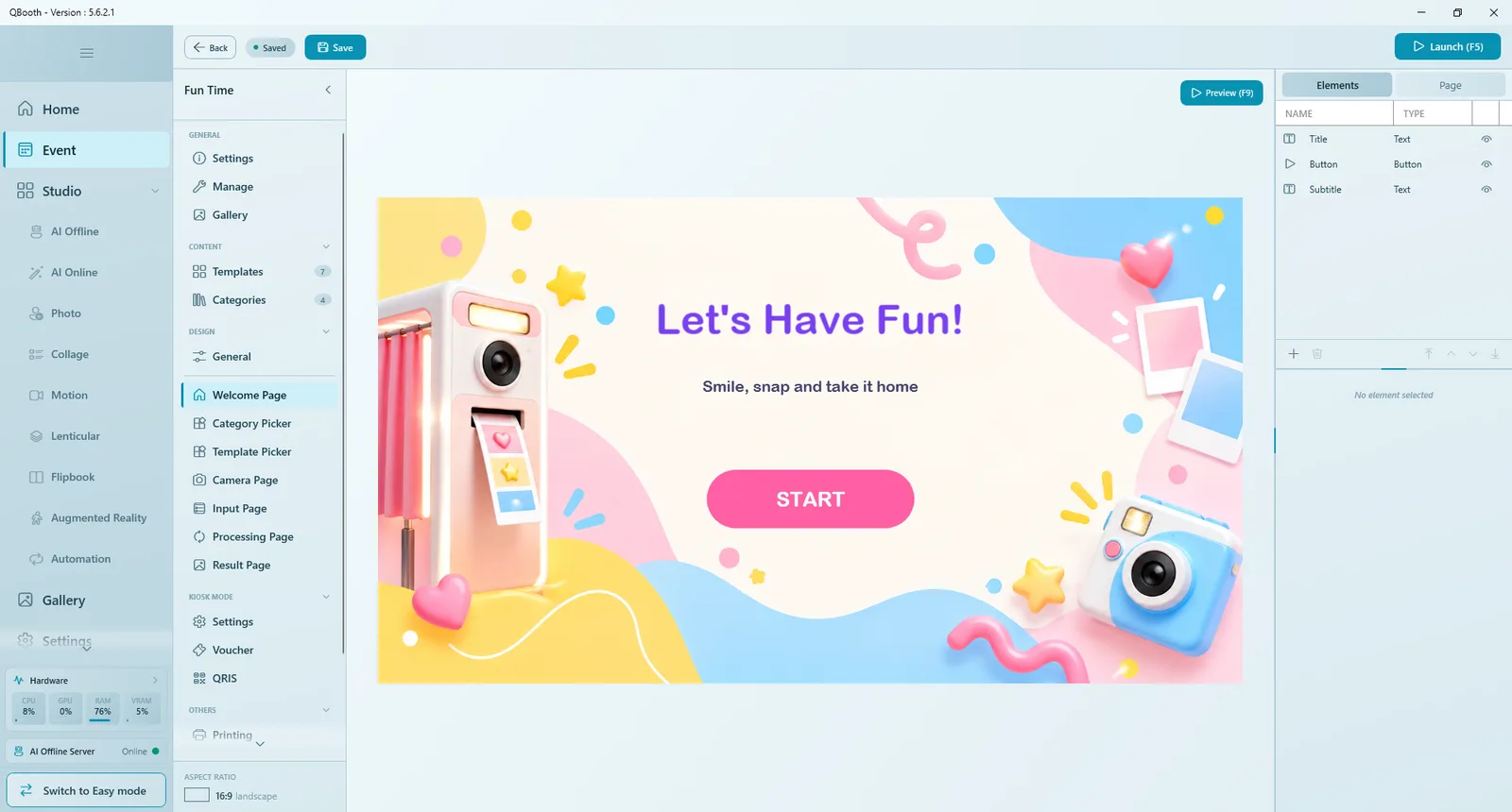
| Part | What it does |
|---|---|
| Canvas | The page exactly as guests will see it. Click an element to select it, drag it to move, pull its handles to resize. |
| Preview (F9) | Plays this page full screen with its animations. Nothing real runs (no camera, no template). Click anywhere or press Esc to close. |
| Elements tab | The list of everything on the page, with NAME, TYPE and an eye icon to hide or show each element. |
| Page tab | Settings for the page as a whole: background, intro audio and page-specific options. |
| Element toolbar | Add element (+), Duplicate element, Delete element, and the layer buttons Bring to front, Bring forward, Send backward, Send to back. |
| Properties panel | Appears under the list when an element is selected. |
Working with elements
The same steps work on every page.
- Click Add element (+) under the element list and choose a type: Button, Text, Image, Video or Shape. Some pages add their own types (for example Countdown on the Camera Page).
- The element appears on the canvas. Drag it into place and pull its corners to resize it, or type exact values under POSITION & SIZE.
- Set its properties: for text, the label and FONT (family, size, alignment, color and a shadow so text stays readable on any background); for images and videos, the file.
- Under APPEARANCE, set Opacity and Corner (rounded corners; the maximum makes a pill or circle).
- Under ANIMATION, choose an Entrance effect (how the element appears when the page opens) and an Idle effect (a motion that loops while it is on screen, like a gentle pulse). Each has Speed, Delay, Intensity and, where it applies, Direction.
- Press Preview (F9) to check, then Save.
Layers, hiding and required elements
- Elements sit in layers. Use the four layer buttons (or drag in the list) to bring one forward or send it back.
- The eye icon hides an element without deleting it.
- Elements marked with a star are required for the page to work (for example the camera feed). They can be hidden but not deleted.
- Click an element's name in the list to rename it, so the list stays easy to read.
Buttons
Select a button to see its BUTTON properties.
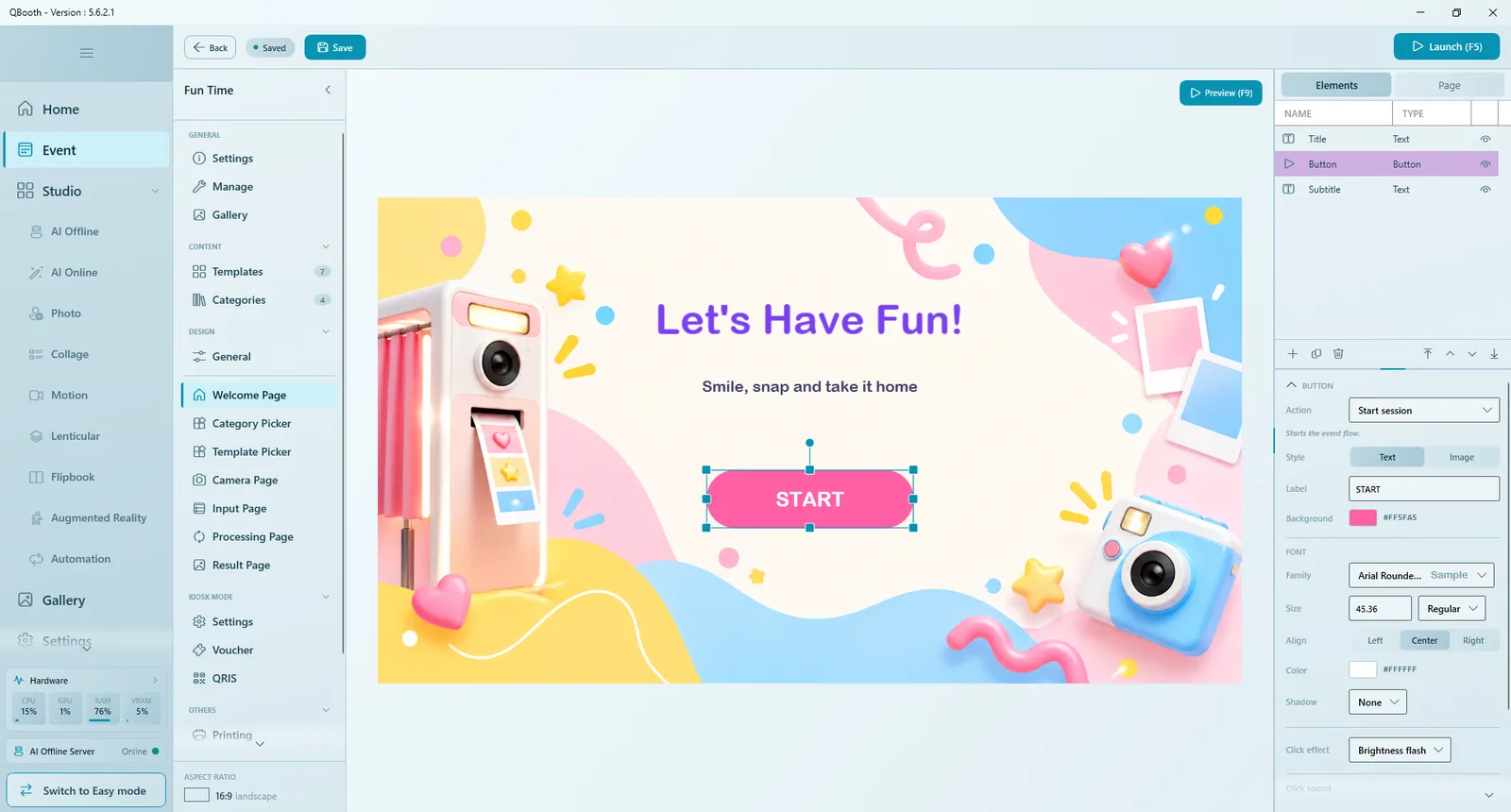
| Property | What it does |
|---|---|
| Action | What the button does on this page. The list depends on the page (see each page below). On every page you can also use Open URL to open a web link inside the app or in the browser. |
| Style | Text: a label on a colored background with its own font. Image: your own picture (Standby image, plus an optional Pressed image (optional) shown while it is tapped). |
| Click effect | Brightness flash, Glow pulse or None. |
| Click sound | A sound played on every tap, with its own volume. |
Buttons show up at the booth according to their action, not their name, so you can rename them freely.
The Page tab
Click Page at the top of the right panel for settings that belong to the whole page.
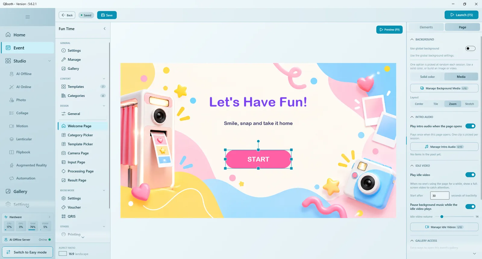
| Group | Options |
|---|---|
| BACKGROUND | Use global background follows DESIGN › General. Turn it off to give the page its own Solid color or Media (up to 15 files in Manage Background Media, one picked at random each session), with Layout and, for video, Volume. |
| Intro Audio | Play intro audio when the page opens: one clip from Manage Intro Audio plays once per visit. |
| IDLE VIDEO (Welcome Page) | Play idle video full screen when nobody has touched the page for the number of seconds in Start after. Options: Pause background music while the idle video plays, Idle video volume, and the clips in Manage Idle Videos. |
| Gallery Access (Welcome Page) | Extra ways for staff to open the event gallery during the event: Secret area (double-click the top-left corner) and Hotkey (Shift+F2), optionally with Require PIN. |
| Start Session (Welcome Page) | Require PIN before a session can start, to keep the booth closed until staff unlock it. |
Other pages have their own Page tab options, described below.
Welcome Page
The first screen guests see, and also the standby screen when the booth is idle. It needs one thing: a clear way to start.
- Add a Button and set its Action to Start session. Make it big and easy to spot. Without it the editor warns No Start button - can't start session.
- Add a title and a short subtitle with Text, and decorations with Image, Video or Shape.
- Give the title an entrance effect and the start button an idle effect such as a pulse.
- In the Page tab, set the background and an idle video to attract passers-by.
Other useful actions here: Launch Gallery (opens the event's result gallery) and Open URL. Templates are not chosen on this page; they are chosen on the Template Picker.
If you use Kiosk Mode, guests pass a payment or voucher step right after tapping start.
Category Picker
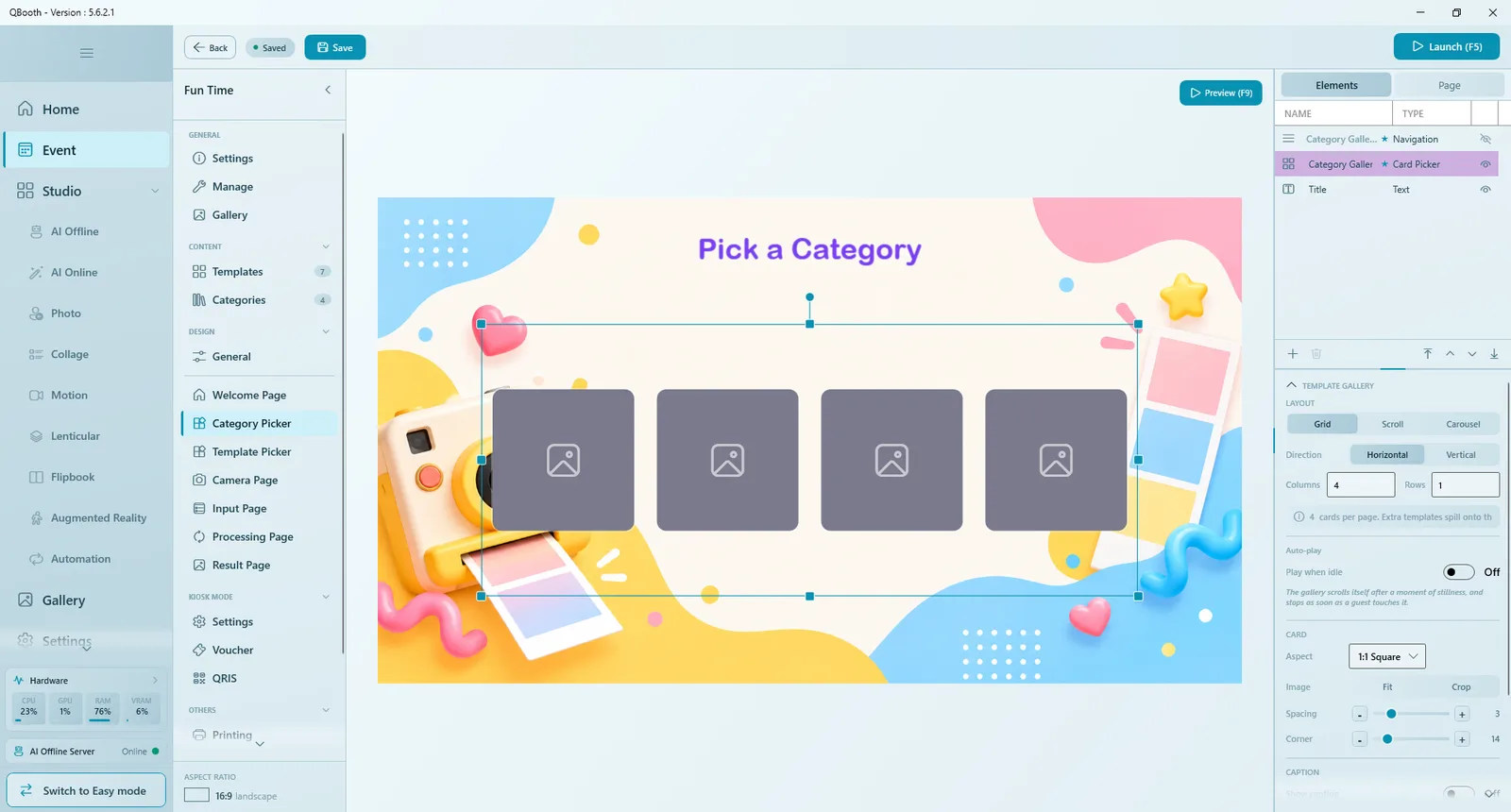
Appears only when Display Mode is As Standalone Page. It shows a card gallery with one card per category (its cover, or its name when there is no cover), a navigation element and a title. Set up the card gallery exactly as on the Template Picker below. There is no Simulate here; use Preview (F9).
Template Picker
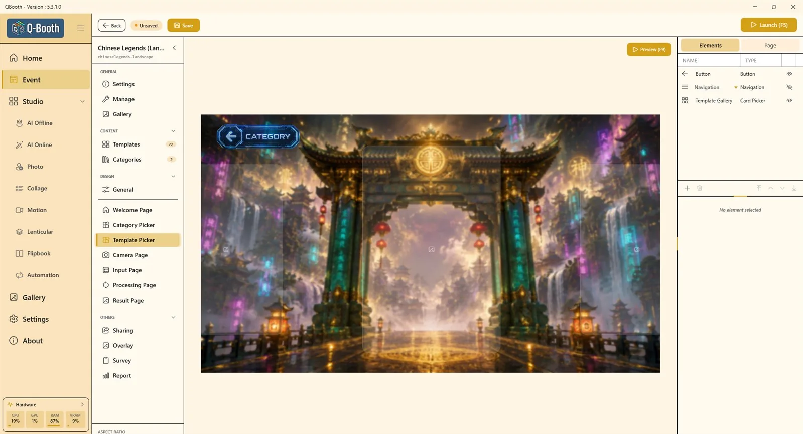
Where guests choose a template. Its main element is the Template Gallery (a card picker showing the event's switched-on templates). If the page has no gallery, the editor warns that guests will have nothing to pick; add one with Add element (+).
| Gallery setting | Options |
|---|---|
| CATEGORY | All (the category the guest picked, or everything), No Category (only templates without a category), Select (always one fixed category). |
| LAYOUT | Grid (pages of cards), Scroll (a continuous swipe) or Carousel (one centered card with the neighbours peeking in). Direction: horizontal or vertical. Columns and Rows set the cards per page; extra templates spill onto the next page. Carousel adds Side Cards and Loop. |
| Auto-play | Play when idle: the gallery scrolls by itself after a moment of stillness and stops as soon as a guest touches it. |
| CARD | Aspect (card shape, or custom), Image Fit or Crop, Spacing, Corner. |
| CAPTION | Show caption with font, background and opacity. In a carousel only the centered card shows its caption. |
| Sound | Card Tap Sound and Swipe Tick Sound. |
- The Navigation element moves between pages of cards: Style Buttons or Dots, Prev / Next, Page Number, and Swipe on element. It is a separate, visual element.
- Button actions on this page include Back (return to the previous page), Open category filter (for categories As Filter) and Next. With a Next button on the page, tapping a card selects it instead of going straight on.
- Match the card Aspect to your template covers (for example 2:3 for portrait prints) so covers are not cropped.
Camera Page
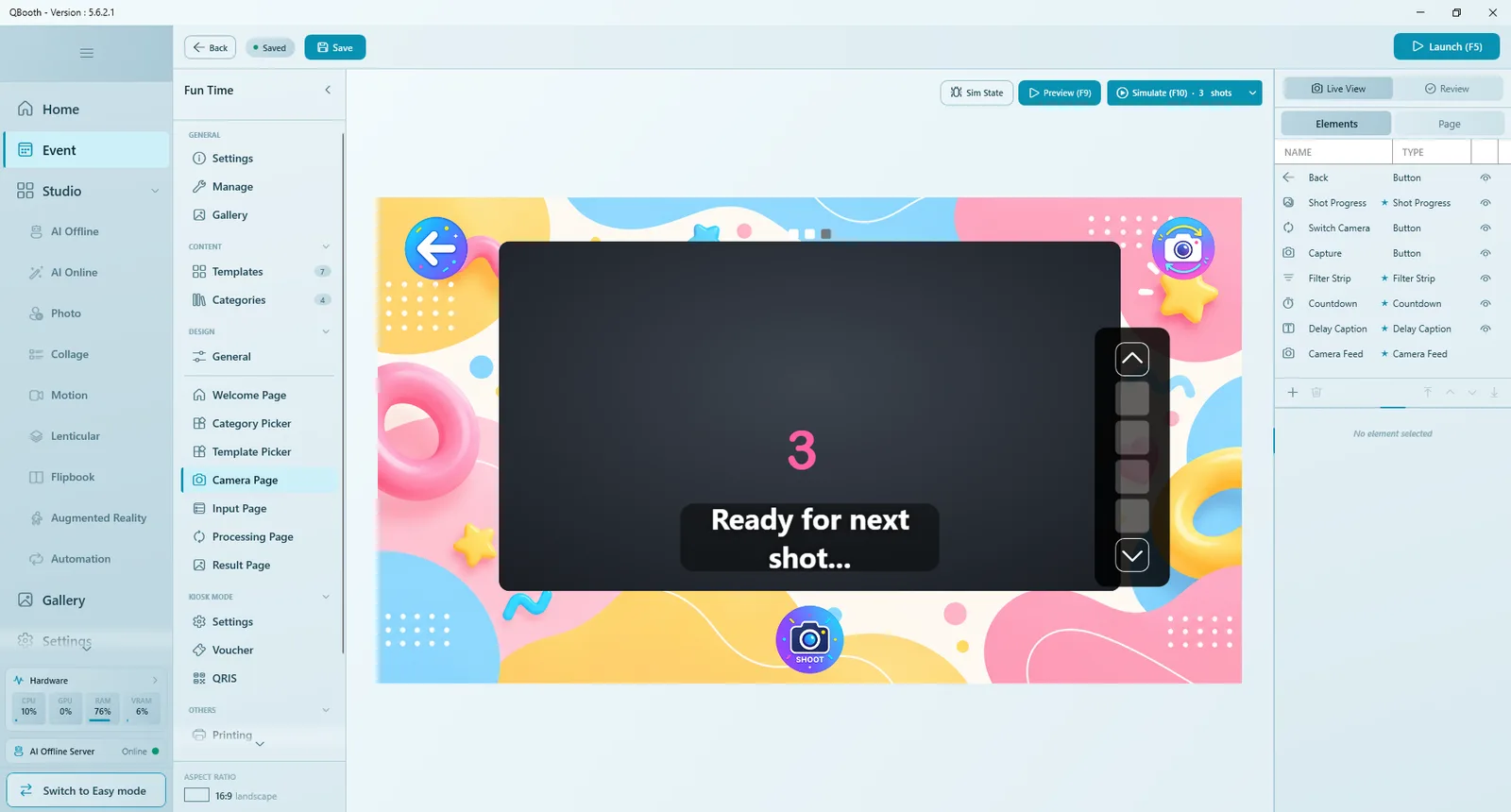
The page with the most options. It has two states, switched at the top of the right panel: Live View (what guests see while shooting) and Review (the shots before going on). Shared elements such as the camera feed live in Live View.
| Element | What it does |
|---|---|
| CAMERA FEED | The live camera picture (and the photo after the shot). Fit Cover or Contain, Border, Corner, Mirror preview, Aspect ratio lock, and Zoom to crop (live view only). A guide inside it shows the crop of the template the guest picked. |
| Countdown | The big numbers before each shot. Start at (default 3), style, font, color, Sound (None, Sound Pack or My Audio) and Pause background music during countdown. Optional: without a Countdown element the shot fires as soon as Capture is pressed. |
| Shot Progress | Shows which shot the guest is on, for example "Shoot 2 of 3". Appears only for templates with more than one shot. |
| DELAY CAPTION | Text shown between shots, such as "Ready for next shot…". Never shown in single-shot sessions. |
| Filter Strip | A row of filters guests can choose. Display during: Before, After or Both. It appears only when the event has two or more filters (see Overlay & Filters). |
| Buttons | Live View: Capture, Switch camera (hidden when only one camera is set up), Back. Review: Process and Retake. A Live View Toggle element turns the live preview on and off. |
There is no shot-count setting on the Camera Page. The number of shots comes from the template the guest picks; for example a collage with three photo slots takes three shots in a row.
Camera Page: Page tab
| Option | What it does |
|---|---|
| Capture Sound | A sound at the moment of the shot (Manage Capture Sounds, volume). |
| Cue Video | Play cue video before the shot: a short full-screen clip right after the countdown, for example pointing to where the camera is. Options: Start 1 second before the shot, Only show cue video once, pause background music. |
| Hide Back button after capture | Guests cannot leave by accident in the middle of a session. |
| Flash effect on capture | Flashes the screen white when the shot fires. |
| Auto capture next shot and Delay | In multi-shot templates, the next countdown starts by itself after the delay; off, guests press Capture for each shot. |
| Auto capture | Skips the Capture button: the shot fires by itself after the set time. |
| Auto process | Taps Process automatically after the set time. Together with Auto capture, the booth runs hands-free. |
| Shoot from the camera | Canon only: the camera's own shutter button takes the shot; live view is off and guests frame through the viewfinder. |
Simulate (F10)
Simulate (F10), only on the Camera Page, walks through the whole capture flow with sample photos instead of a camera: countdown, cue video, flash, several shots, retake and auto capture. Choose 1 or 3 shots in the button's menu. Press R to restart and Esc to exit. Sim State switches the canvas between the live view and review states while designing.
Input Page
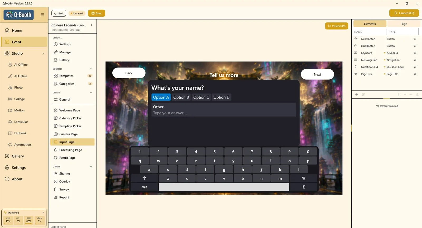
Shows questions guests answer on the booth screen: survey questions, text a collage template asks for, or choices for a dynamic prompt (see Survey and Dynamic prompt).
| Element | What it does |
|---|---|
| PAGE TITLE | A title that changes with the kind of question being asked. |
| QUESTION CARD | Shows the current question and collects the answer. Colors, fonts and the multiple-choice STYLE (Pills, Cards, List; Continuous or One per row). |
| Q. NAVIGATION | Previous / next arrows and an "N of M" counter. |
| ON-SCREEN KEYBOARD | Position, size and colors. It pops up when a guest taps a text field. Options: Include number row, Include special characters (!@#), Include email domain row (@gmail.com ...), Auto-capitalize sentences. |
| PAGE NAV BUTTON / PROGRESS BAR | Back and Next buttons (Next becomes active once every question is answered) and an overall progress bar. |
Processing Page
What guests see while the result is being made. Choose the Processing display at the top of the page:
- Simple Dialog: a small box with a looping loading animation. Manage Display Media holds images or clips (one picked at random each session); Display Size sets its size.
- Designer Page: a full page you design yourself, for example with a colorful video, a timer and fun messages.
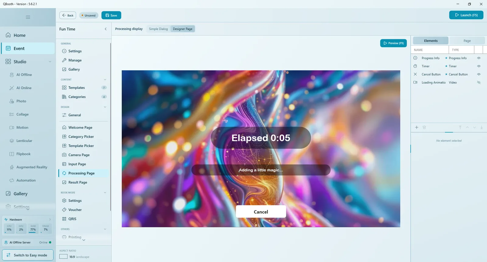
| Element / option | What it does |
|---|---|
| Progress Info | The status line. Use fun messages replaces the technical status with playful lines that change every 5 seconds. |
| Timer | Elapsed time. Format uses {x} for the time, for example "Elapsed {x}". |
| Cancel Button | Stops the job and returns the guest to the camera. It appears only after the cancel delay set in Settings (default 60 seconds). |
| Loading Animation, Logo | A video or image that plays while waiting, and the app logo. |
| Minimum show time | Keeps the page up at least this long (0 = off), so very fast templates do not cause a jarring flash. |
Result Page
Shows the finished result with your buttons. Required elements: RESULT VIEWER (the photo or video; swipe when there are several results), QR CODE and RESULT TIMER.
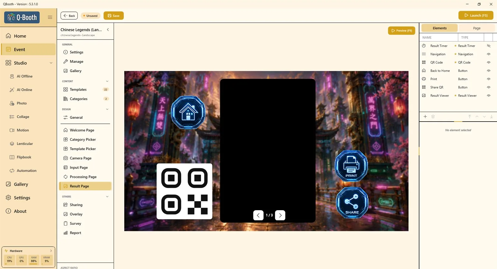
| Item | What it does |
|---|---|
| RESULT VIEWER | Aspect ratio (Original follows the result; Free lets you size the box), corner and border. |
| QR CODE | Guests scan it to download their photo. While it is visible every result is uploaded automatically, so the code always has a live link. It stays square. |
| RESULT TIMER | Shows the time left before the page returns to the start, as Text or Arc. The duration is set in the Page tab under RESULT PAGE DURATION › Auto-return (Off = no auto-return). |
Button actions on the Result Page:
| Action | What it does |
|---|---|
| Back to Home | Ends the session and returns to the Welcome Page. |
| Prints the result shown (see Sharing and printing). | |
| Web QR / Local QR | Shows a QR code for the result, over the internet or over the booth's own Wi-Fi. |
| Send Email | Asks for an address and emails the guest a link. Email works only once it is set up in Settings. |
| Reprocess | Makes the result again from the same shots. |
| Restart Session | Starts again straight from the Camera Page, skipping the template choice. |
| Switch Template | Runs the same photos through another template that fits them. |
| Show All Results | Shows every result of this session. |
In Kiosk Mode the result page always returns automatically, and Restart Session and Switch Template are hidden so a guest cannot start again without paying.
Preview, Simulate and Launch
| Tool | Where | What it tests |
|---|---|---|
| Preview (F9) | Every page | The look of one page with animations. No camera, no template. |
| Simulate (F10) | Camera Page only | The full capture flow with sample photos instead of a camera. |
| Launch (F5) | Event Editor or event list | The real booth: real camera, real templates, print, QR and email. |
Design tips
- Design for the real screen: check text size and button size from where guests will stand.
- Keep one clear action per page; make that button the biggest thing on screen.
- Use a shadow on text placed over busy backgrounds.
- Keep backgrounds, fonts and button style consistent from page to page.
- Use Export Theme once a design works, so you can apply it to the next event in one click.
Common problems
Guests cannot start a session.
The Welcome Page needs a button with the Start session action. Also check whether Start Session › Require PIN is on in the Page tab.
The photo is taken without a countdown.
Add a Countdown element to the Camera Page in Live View, or make sure it is not hidden.
The filter strip does not appear at the booth.
It only appears when two or more filters are available for the event.
The processing page only flashes for a moment.
Fast templates finish quickly. Raise Minimum show time so guests can see your design.
The result page never returns to the start.
Set Auto-return under RESULT PAGE DURATION in the Result Page's Page tab, or add a Back to Home button.
Next steps
Still need help?
Our team answers on WhatsApp. Tell us your Q-Booth version and what you see on screen.